

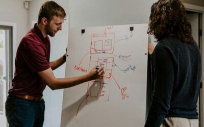
Here are 5 steps to quickly tell if your web page stands a chance and how to fix it.
1. AROUSE THE INTEREST – FIRST REACTION
Many times, we visit websites and within the first few seconds we decide “nope, that’s not the real thing here”. What is that “magic” formula that separates the “good” from the “bad” and the “ugly”?
The first question a visitor – “Joe” – asks, even if unconsciously, is “How does this site make me feel?” Not surprisingly, this is exactly how our brain also creates first impressions of people. Researchers calculate that the human retina can transmit data at roughly 10 million bits per second. It’s natural, then, that “first impressions” are made within that first second. Without a positive first reaction Joe is gone.
First step is to ensure that we are managing to arouse his interest instantaneously. Consider the following four main factors:
- Layout & Proposition. Are the page’s elements laid out in a familiar way: headers and main proposition at the top (logo with tag line), navigation following to the right or below, and body content traversing top to bottom? Is there enough white space to make the page pleasing to the eye rather than being cramped and hard to read? Do most elements’ relative proportions fit the Golden Ratio – for example, roughly 62% body width with a 38% sidebar width or white space? (Caution: This rule can be more “loose” on the mobile viewport with its conservative web space real estate.)
(Is your website mobile-friendly? Take this test to find out.) - Typography. Is the body copy in a consistent font, at a consistent size (16px or above), with a line-height of around 140%? Are there any elements such as short paragraphs subheadings and bulleted lists, which break the monotony of an otherwise long piece of body copy?
- Color. Is the page designed with a consistent palette, using no more than four main colors? Is this palette appropriate for the site? (For example, Red for Excitement and Love, Yellow for Happiness, Blue for Corporate and Trust, Orange for Clarity and Warmth, etc. – Read more on the Psychology of Color.) Is the body copy black on white background (or their close variations)? Are some elements too colorful, making them visually dominant and stand out when they should not?
- Expectation. Does the site match or exceed what Joe was expecting – or does it trigger feelings of uncertainty? For example, if Joe was looking for home insurance products, he may feel more comfortable landing on a page that is a part of a larger business site offering all kinds of insurance. Joe may feel uneasy about a page alone in the vacuum. If he arrived via an ad, the page should deliver exactly what the ad promised, and with similar wording.

“First impressions” are made within the first second. Tap into your visitor’s feelings.
2. ORIENTATION
Once it has Joe’s attention, a page must quickly orientate him and answer his basic question “Am I in the right place?” The page must look promising at first look, and if he doesn’t feel confident about where he is within the very first few seconds, he will leave. Therefore, every page must clearly show him he is in the right place. Consider the following four elements to watch out for here:
- Logo & Tagline, The Masthead. Should be at the very top of the page, perhaps even accentuated further with more short 1-liners, close to the top. On our own website, commbits.com, we accompany our logo with “All-inclusive web design services” to further explain the site’s purpose in clear language.
- Navigation. Early-on Joe glances the Nav-bar to get a sense of the places he can go, which also quickly reveal the site’s structure and the options available to him. Is it clearly identifiable, using standards, or is it hard to spot, and contains labels he doesn’t understand?
- Headline. This works with your tagline to further orient Joe, using keywords to help him understand the specific page he is on in relation to the site as a whole. It also implies the benefit of reading further. “Orientation” really means finding your own space in the jungle of all kinds of competitive offerings by researching on what your prospective clients are most probably looking for, and explaining the same in simple, clear-cut words.
- Search. Google became “Google” because web users are search oriented. Follow the same trend on your own site by offering a search mechanism at the top or bottom of the page, with a button labeled “Search”.
The page must look promising at first look and answer the basic question “Am I in the right place?
3. CREATE THE NEED
The “Desirability” factor! “What’s it in for me?” and “Will I gain more than I invest?” Joe always wonders this – if not in as many words – before he clicks on anything. So, before you ask Joe to click you must explain the value. His perceived gains must be greater than his perceived investment. This is measured primarily in emotion – not in time or money. Your page must “create the need”.
If the investment required is small, then the desirability can be small too. But if the potential for emotional turmoil and effort of talking to someone is high, or if the perceived cost is high, then the desirability must be high. There are four main elements which you can use to “Create the Need”:
- Headline. This has to entice Joe into reading your copy. If it doesn’t, you won’t get any conversions. So, try to engage with what Joe is already thinking. Take a problem or a question, fear or desire already on his mind, and appeal to his self-interest directly and clearly. Then put yourself in his shoes, read the headline you’ve written and ask “So what? What’s in it for me?” If you can’t answer, rewrite your headline accordingly.
- Body copy. The purpose of your copy is to get Joe from what he believes about your offering when he arrives, to taking you up on it immediately. Here are some helpful techniques towards this strategy:
- Promise him something; (something you KNOW you can deliver)
- Have Joe picture that promise fulfilled.
- Prove that you can fulfill it; (Show previous work, portfolios, testimonials, etc.)
- Push him to accept your offer.
Whatever you are asking Joe to do, don’t focus on selling it. You’re not an advocate for your offering. You are an advocate for Joe and his interests. “Own” Joe’s project before it ever commences and you will be in a much better position. Genuinely care that he makes the choice which is best for him. Always explain your offering in exactly the same way as if you were speaking directly to him and show him how you believe your offering is the best to what he is trying to achieve. Clarity wins over persuasion. People hate being sold to and – make no mistake – they know when you’re trying to just sell something to them. But people also love to buy, and they love feeling that someone is helping them make a wise decision. If you can make Joe feel that way, you are in a safe and fair spot and you will do well.
- Images. Images “create the need” with great force, provided they’re used correctly. They must demonstrate to Joe that his return will outweigh his investment. Copy and headlines & tag lines also contribute, but there are times when images convey value more effectively than copy:
- Hero shots (usually large, wide graphics and photos at the top of a page with superimposed tag lines) help Joe relate to the provider of service or product as a real person;
- Product shots show rather than tell. “A picture is worth a thousand words”; it’s a cliché but it’s true, if used effectively;
- Trends & statistics are easy and quick to grasp when presented graphically, for example with the use of infographics.
- Speed. The “faster” your page feels, the better it will do. Except in special cases, especially AFTER the sales process is complete, long sign-up forms with numerous mandatory fields look like a lot of effort; they are slow and they will deter Joe. Joe won’t read if there is excess verbiage, which prevents him finding the information he wants, stalling his momentum. Your pages should also load fast from a technical standpoint. Within three seconds or less, otherwise, again, you stand quite a high chance of loosing Joe on the merit of impatience. See our related post on how to Boost Your SEO WIth Better Site Speed.
Perceived gains are measured primarily in emotion – not in time or money.
4. PROVIDE INFORMATION
At this point, Joe asks: “Ok, I may be interested. But I want to find out more”. Are you providing more detailed information about what you offer and how your offering is a match to his needs? If yes, are you doing this in an unobtrusive way, without running the risk of spoiling the “fertile” environment your page has created thus far? Here’s what to watch for:
- Body copy. Long pages without headlines or other styling objects quickly become boring and uninviting. Consider the following techniques to break your copy into logical groupings and convert your static content to engaging content:
- Use different colored-background sections to group your copy.
- Hide long pieces of copy behind toggles, which expand only when a visitor decides he WANTS to read more detail on that specific piece. {Example}
- Hide bulleted lists in accordion style objects, where only one item and its accompanied text is open at any given time – keeps the page uncluttered.
- Use bar counters and other infographics as a quick way to communicate detailed information.
- Use multiple columns, again, as a way to break the monotony of otherwise long, same-style body content.
- Use sliders and program them to rotate their content automatically along with providing manual navigation control – people like to be on the driver’s seat.
- Purpose. Is your body copy directly related to, and further builds on the headlines and tag lines above? Even when you provide more information, remember your objectives: Promise Joe something you know you can deliver. Prove that you can deliver by including detailed information that may help establish you as an authority in your field, a field Joe is interested in. Portfolio of your work and testimonials work well.
- Back to Top. If Joe finds your body copy interesting and engaging, he will scroll-down the page to read more. Does your page have a simple “go-up” button stuck on the sidebar, to bring him up to the top where your navigation is, in a single click?
- Images. If used wisely, images can also break the monotony of an otherwise long piece of copy. Use images related to your copy and place them strategically, close to the copy they are related to.
People don’t buy from websites—they buy from people. People they trust. Write like you would talk.
5. CALL-TO-ACTION (CTA), YOUR OFFERS
Assuming the page was indeed successful in “creating the need” and Joe now is ready for more, the final hurdle the page must overcome on the way to success is the “Call-to-Action” – what we offer, and how we get Joe’s contact information for further validation and hopefully, closing the deal.
The CTA is usually a web form asking for a visitor’s basic contact information such as name and email, accompanied by some inviting copy text. How well these will work is determined by three main factors:

- Placement. Is the CTA and what is being offered the same thing that Joe wants at this point on the page? Has there been a logical progression on the page, from “creating the need” to “providing information” to the CTA? Since that logical progression works from top to bottom, it makes sense to have the CTA at the bottom of the page.
- Visibility. Does the call-to-action (especially the button) stand out? As the button gets bigger it will get more clicks. Orange, with its optimistic and warm nature, is a good choice for CTA buttons; avoid red, which although speaks for bold excitement, it may also associate with risk and danger. Of course, other exceptional factors may be at play here, such as logo colors. (With On The Spot Carpet Cleaning we made a conscious choice to use red throughout the site due to the company’s weight on red on their logo and branding material. Therefore, a red CTA button is not surprising the visitor; it rather complements what was at display thus far.)
- Phrasing. Does the CTA re-enforce Joe’s payoff, or does it ask Joe to do something? Is it considering Joe’s goals, or is it considering the page’s goals? The former will always work better than the latter. CTA buttons should start with a verb like “Get” or other action statements that put Joe on the driver’s seat and help him imagine the future if he chooses to work with you.
In your CTA consider Joe’s goals, NOT your page’s goals.


Excellent information for us, COMMbits! There is always room for improvement. At HNF, we are grateful for your guidance and marketing efforts to enhancing our image and programs.
Thank you, Allison.